UX Case Study
Restaurant Loyalty Mobile App
Mobile | UX Design | Usability Testing | Google UX Course Project 2022
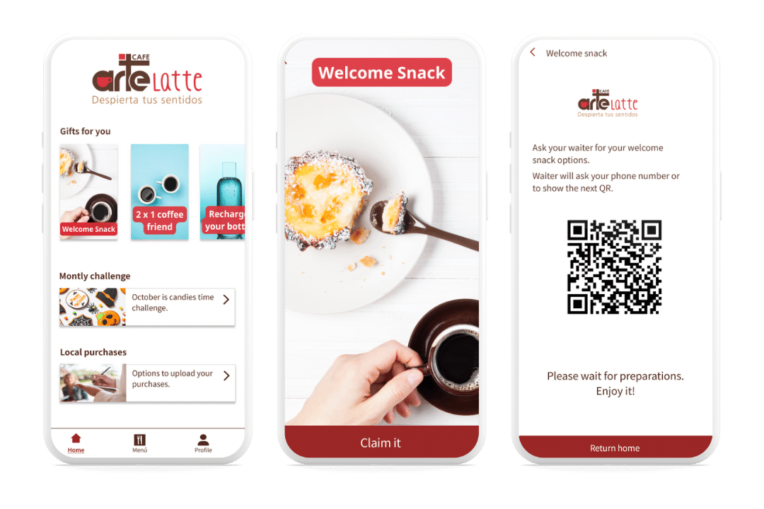
This case study focuses on a user experience (UX) design for a mobile app aimed at frequent customers of a restaurant.
Project Summary
As part of my continuous learning journey, I started the Google UX Designer certification on Coursera. The first project involved creating a mobile app, and I chose a customer loyalty service for restaurants.
The challenge was clear: How can we effectively identify frequent customers and reward their loyalty?

Project Details
Part of
Google UX Designer Certification
Project Duration
2 Months – 2022
Responsibilities
UX Research, UX Designer
Research
With an analytical approach, I aimed to understand users’ needs and desires. I conducted research utilizing various methodologies, such as surveys and interviews, targeting two main user groups: restaurant owners and their customers. Additionally, I carried out a competitive analysis of similar apps.
This data collection uncovered valuable insights, from restaurant owners’ reluctance to create a new database to customers’ concerns about promoting the app and safeguarding their personal data.
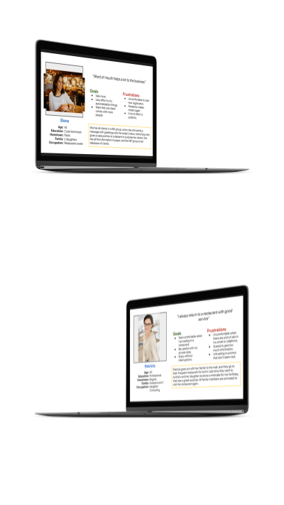
As a result of the analysis, deliverables such as user personas Elena and Patricia were developed, outlining their specific challenges, goals, and desires. I also created a user journey map to visualize improvement opportunities and identify key touchpoints to focus on for the UX design.
UX Design
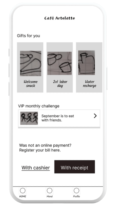
Focused on the priorities and goals, I began the exciting process of designing the loyalty app. I started with paper sketches to explore a variety of ideas, imagining how to streamline the user registration process and offer a seamless, rewarding experience.
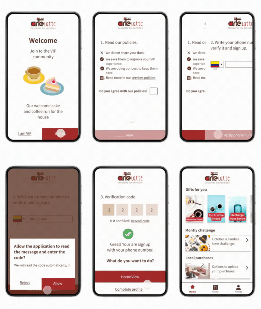
I then translated these ideas into digital sketches using Figma, outlining the structure and basic content of the user registration process, with the goal of ensuring it was comfortable, quick, and reassuring, granting easy access to rewards. The sketches evolved into low-fidelity prototypes, connecting the primary user flow from registration to claiming their first reward.
With this initial version, I conducted user testing, gathering valuable feedback that revealed important areas for improvement, such as the need for a confirmation page for gift redemption and clearer instructions on how to register purchases. With these findings in mind, I adjusted the prototype, iterating to address these concerns.
Refinement
I advanced the design’s evolution towards its final version, beginning with the creation of high-fidelity mockups, where I applied visual UI design principles: selecting fonts and color palettes, adding images and icons, and carefully considering layout design and whitespace. During this process, I adhered to best practices to ensure an optimal user experience, drawing inspiration from branding I had done for a restaurant in the past.
I then moved on to creating the high-fidelity prototype, which underwent another round of user testing. This round provided valuable feedback, such as the need for clearer labels on the app’s main view and on the buttons for registering purchases. It also highlighted the importance of focusing on the registration options.
In response to these findings, I adjusted the mockups and prototype to improve the user flow. Additionally, I paid close attention to accessibility, ensuring that each button had a clear label to explain the action, using high-contrast colors to enhance readability, implementing subtle shadows to highlight important elements, and adhering to best practices for primary and secondary buttons.
Secondary Background
Primary
Secondary
Success
Aa
Noto Sans SC 32pt
Noto Sans SC Regular 24pt
Noto Sans SC Regular 16pt
Noto Sans SC Bold 14pt
Vestibulum ante ipsum primis in faucibus orci luctus et ultrices posuere cubilia Curae; Donec velit neque, auctor sit amet aliquam vel, ullamcorper sit amet ligula. Cras ultricies ligula sed magna dictum porta. Mauris blandit aliquet elit, eget tincidunt nibh pulvinar a. Sed lectus nibh.
Conclusions
Looking forward, I take away valuable lessons from this project and a clear understanding of the entire UX design process.
Usability testing results showed a strong willingness to use the app, particularly highlighting how easy it was to register, reflecting the success in creating a smooth and hassle-free experience.
Personally, this case study offered me the opportunity to refresh and update key parts of the UX design process, especially in terms of research and accessibility best practices. I’m loving the accessibility aspect of UX design and continuing to learn more about it. I’m becoming passionate about how accessibility truly benefits everyone, not just people with disabilities, and how many innovations arise from designing for accessibility.
Let’s Connect!
I’m excited to collaborate and discover how we can work together to achieve your goals. I’d love to chat!
