Online Course Store
UX Case Study
- Duration: 3 months, 2023
- Website: bvtrainingcommunity.com
The Challenge
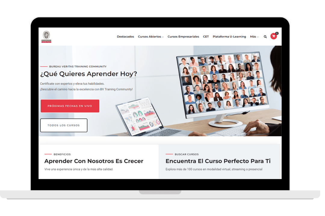
As part of the client’s digital marketing strategy, since 2018 there was a need to promote a dedicated website for training, focusing specifically on customers purchasing courses. Their corporate website offers a wide range of services for businesses.
My team’s work involves managing the training website, web design, content creation, and technical management.
In 2023, we faced an exciting challenge: migrating the existing WordPress website to the Drupal content management system. This migration was not only an opportunity to enhance the site’s functionality, but also to improve web design and minimize any impact on visitor and lead metrics through a carefully crafted SEO optimization strategy.
The Solution
With a focus on excellence and attention to detail, we worked closely with my team and the client’s team to ensure a seamless transition and a significant improvement in user experience.
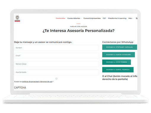
The user experience here goes beyond interaction with the website itself. The site’s design and automated services allow faster responses to potential customers and quicker access to the learning platform. This not only enhances the user experience but also improves the experience for the commercial team handling customer inquiries.
Responsibilities
- Web Design
- Website Management
Technical Conditions
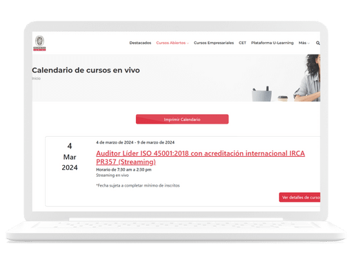
The migration to Drupal itself was a technical requirement, requested by the IT (Information Technology) team at the client’s main headquarters (Switzerland). What did we need to migrate? We had to merge two websites: one for selling virtual courses and another for live courses. Additionally, we needed to integrate payment methods with the existing platform and automate the lead generation process, sending information directly to Hubspot.
User
We have known our user since 2018, with their profile varying depending on the training area. We have demographic segmentation and analyze e-learning user trends for Latin America.
Additionally, we have conducted usability studies and identified pain points and personas. All this has evolved up to the 2023 project.
Design Patterns
We followed design patterns tailored to online course stores that align with our objectives. While our metrics show growth in leads, we still needed to increase direct purchases.
- A responsive design.
- A design with a predominant white background.
- Testimonials were added.
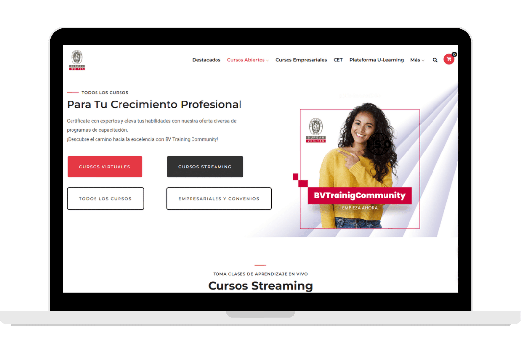
- Images with faces were incorporated to create a human connection.
- Live chat was included for human interaction.
- The course page includes available modalities, with a summary of information at the top and more details as you scroll down.
Visual Design
In this case, we needed to maintain consistency with the brand’s visual style. While the design of the website is not identical to the corporate site (allowing for a more relaxed feel), it still adheres to the use of brand colors and the logo.

Impact
The platform migration from WordPress to Drupal provided us with different technical conditions, such as the need to create a custom payment form, but it also offered the opportunity to tailor the site to the client’s needs.
We have increased visits in January 2024 compared to January 2023 by 17%, and direct purchases have risen by 90%.
Another interesting point is that this website is now viewed more frequently on mobile devices than on desktops, compared to before the migration to Drupal.

Lessons Learned
This project, and managing the website in general, has taught us a lot about the users who seek to learn, who are eager to grow professionally, and who strive to organize their time.
On a personal level, I’ve learned how to communicate with multidisciplinary teams: IT, Marketing, and Sales. These teams share the common goal of growing the company and making the enrollment process as smooth as possible for new students.
Additionally, I’ve learned that some team members are also users of the designed services, and it’s important to consider their experience, such as their use of the chat feature.
¡Conectemos!
Estoy emocionada por colaborar y descubrir cómo podemos trabajar juntos para alcanzar tus objetivos. ¡Me encantaría conversar!
