Mobile Citizen Application
UX DESIGN 2022Services
- Project Management
- UX Research
- UX Analysis and Design
- UI Design
- UI Reviews
Deliverables
- Research Findings
- Design System
- Wireframes
- Icons
- Prototypes
Other
- Consistency with Other Projects
- Design for help website
- Presentation Videos
Project Info
Challenge
Initially, the existing application focused on tax payment management and report visualization. At the client’s request, a comprehensive usability assessment and complete redesign were required to enhance the user experience.
Additionally, it was crucial to ensure that this new design was fully aligned with digital government policies regarding usability.
Solution
A thorough UX design process was conducted based on usability evaluation with users and heuristics, along with a detailed competitive analysis.
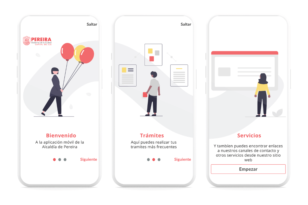
From this analysis, the product scope was significantly expanded, transforming it from a simple tax management tool into a comprehensive application that provides information and other services for citizens.
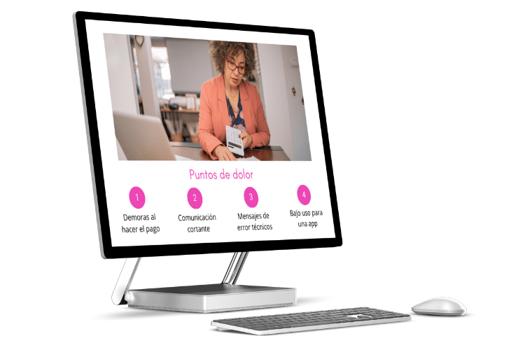
Taxes Use Case – Pain Points
UX RESEARCH
Our goal is to identify user pain points, areas for improvement, and highlight current strengths. To achieve this, we conducted various research activities, including:
- Stakeholder interviews.
- User evaluations with 5 remote tests.
- 1 in-depth heuristic evaluation.
- 1 evaluation of digital government policies on usability and accessibility.
- Competitive audit.
- Product audit.
DEFINITION AND IDEATION
Transforming Analysis into Concepts
Utilizing the insights gathered from empathy research with users and analysis of competition and market, we concluded that the current functionality of the mobile application was insufficient.
We proposed a product vision that not only addressed tax management but also met user expectations. This led to the creation of the application motto: “Bring city services to your fingertips.”
PROTOTYPING AND TESTING
Iteratively Refining and Evaluating
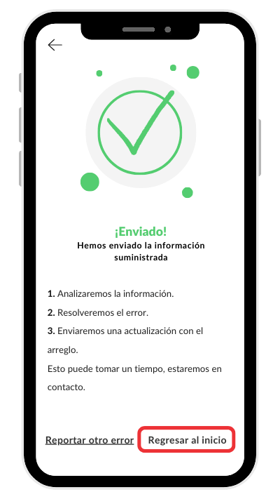
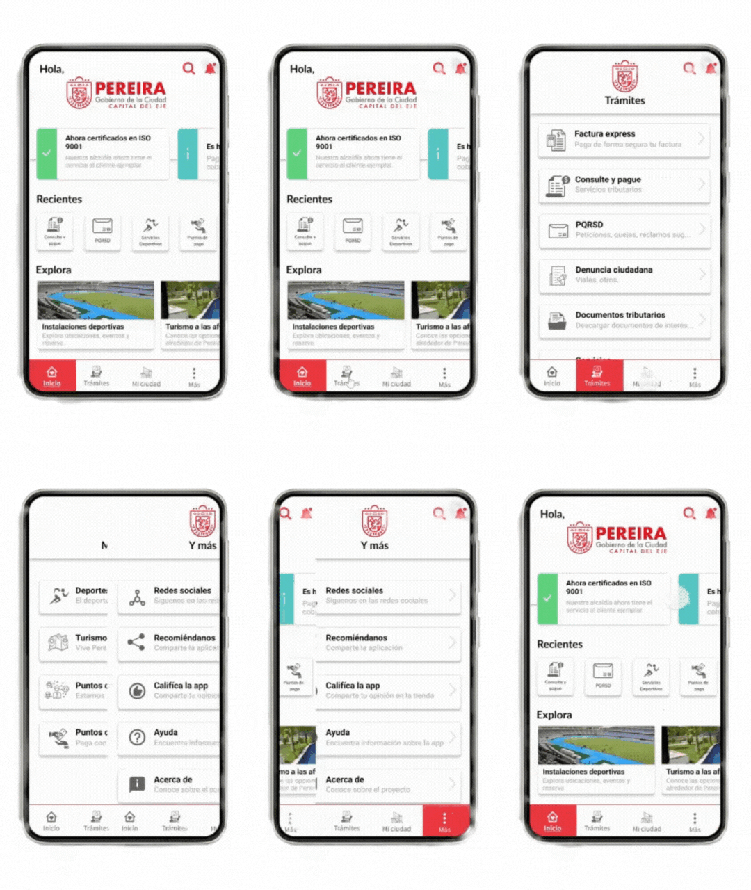
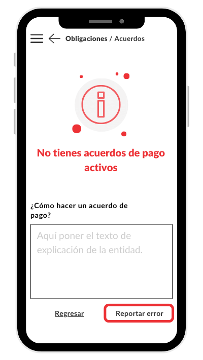
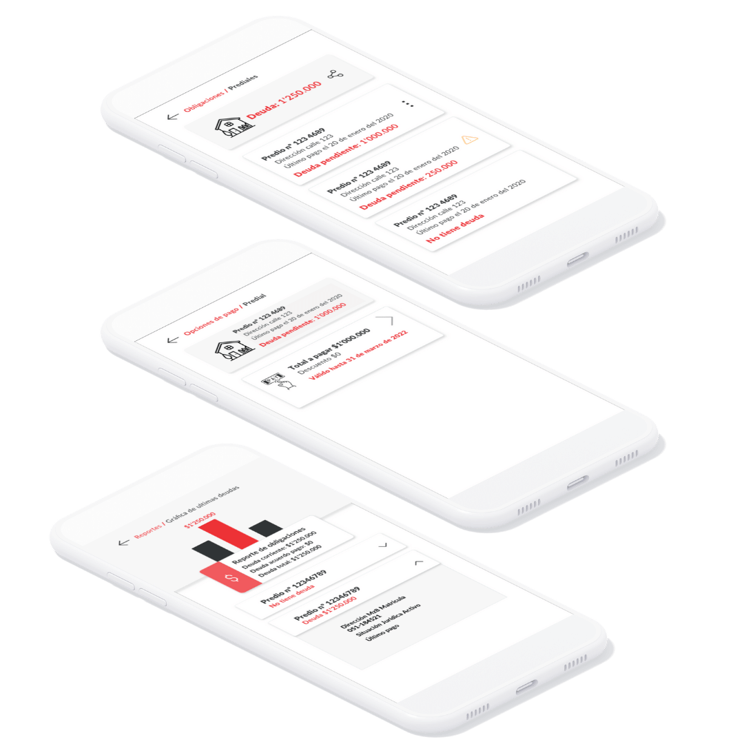
n this phase, we focused on user interface design, prioritizing clarity and simplicity. We opted for a clean, white interface, strategically using brand colors to highlight key functionality and guide the user smoothly through the process. Additionally, we focused on improving error and alert messages, providing clear alternatives and solutions for any issues that may arise.
We conducted comprehensive testing, from visual enhancements to adjustments in the design once implemented, ensuring consistency and accessibility at all times. Our work included creating mockups, designing the system, high-fidelity mockups, as well as reviewing and collaborating as a team to ensure the quality and effectiveness of each iteration.

IMPACT
We transformed a simple tax payment application into a comprehensive platform that directly connects city services with citizens. This innovative solution has been successfully implemented and has generated tangible impact.
As a result, our client has requested more projects, recognizing the value and effectiveness of our collaboration.
LEARNINGS
I’m still learning to strike a balance between client expectations and delivery deadlines in managing design proposals. I have gained significant experience in designing e-gov applications, as well as a deep understanding of the tax domain model.
Additionally, I have honed my ability to use a conversational style in UI and have implemented significant improvements in alert, error, and information messages for a more effective and satisfactory user experience.
Let’s Connect!
I’m excited to collaborate and discover how we can work together to achieve your goals. I’d love to chat!
